UX Design decisions
One of the project's difficulties was that it is highly technical and demands specialised knowledge. A lot of discussions and questionnaires with/to the stakeholders were required to understand the concepts involved, to clearly define the scope of the app and to translate it into a structured and insightful tool. The main feedback came from technical staff of existing Telecom clients. The communication with them was indirect through the Product Manager. The Product Manager had a Telecom engineering background, so he was able to provide valuable information as well. The communication with the backend engineers of the development team was also a very big part of the process, since the feasibility to display every piece of filtered data had to be checked with them.
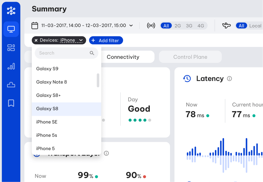
The parameters that turned out to be the most basic and frequently required were placed on the most prominent position and with a single-click access (second top bar). These are the date/time picker, the network type (2G/3G/4G) and the roaming options. Supplementary to these, I designed a filter bar for adding extra filters (third top bar). Apart form the accessibility reasons, I placed these parameters in this prominent position to imply the fact that they are global configurations for all the sections of the app.
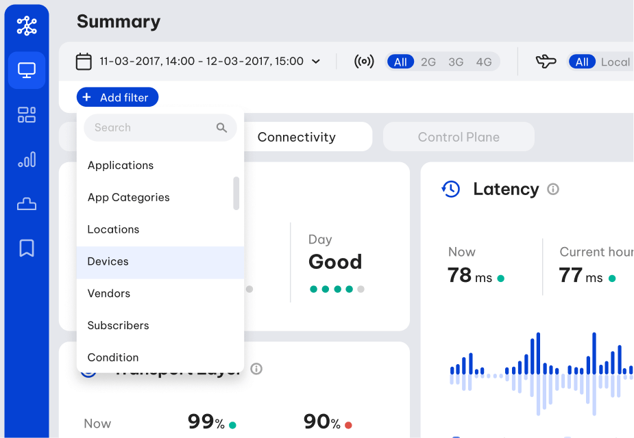
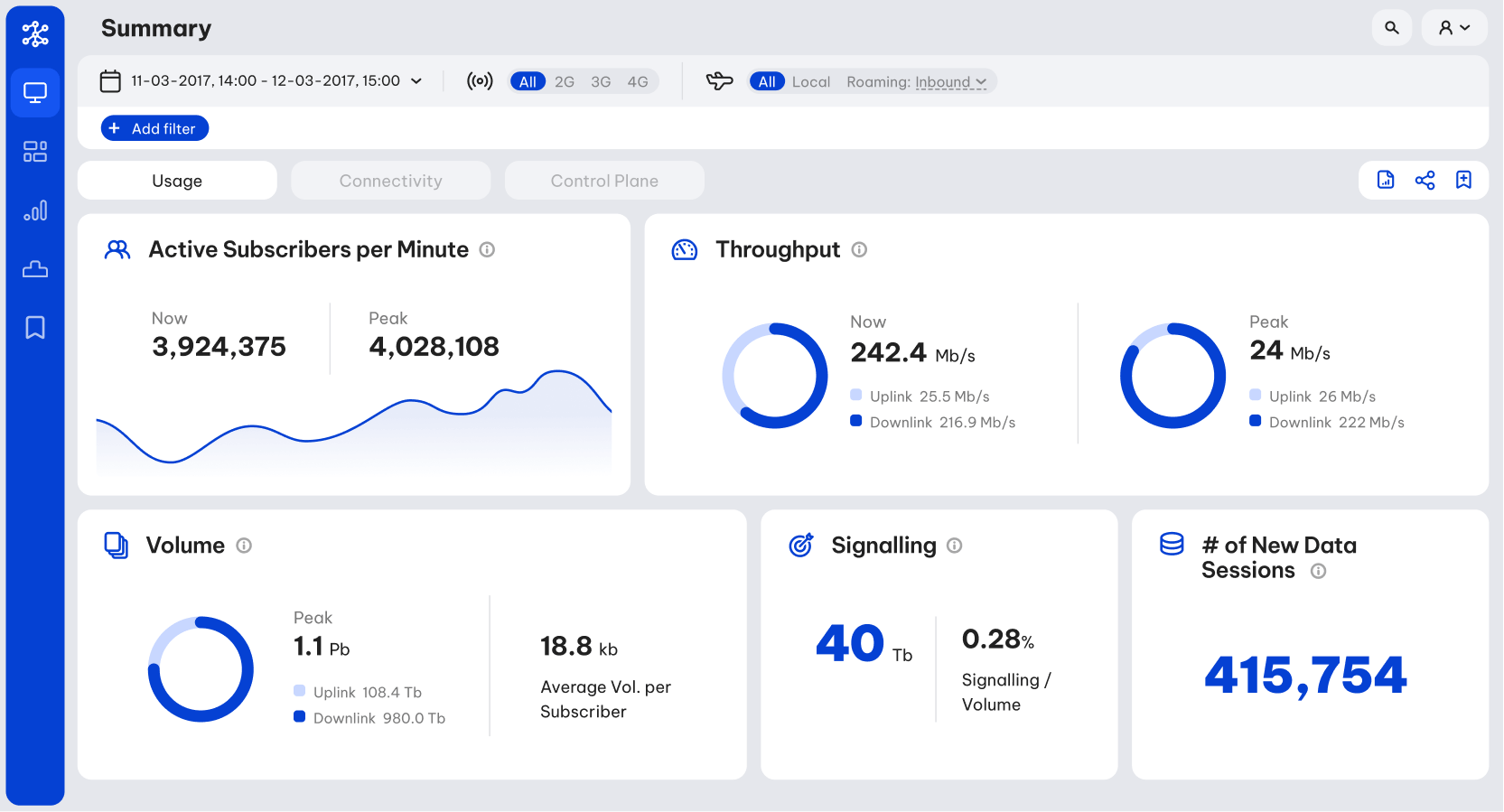
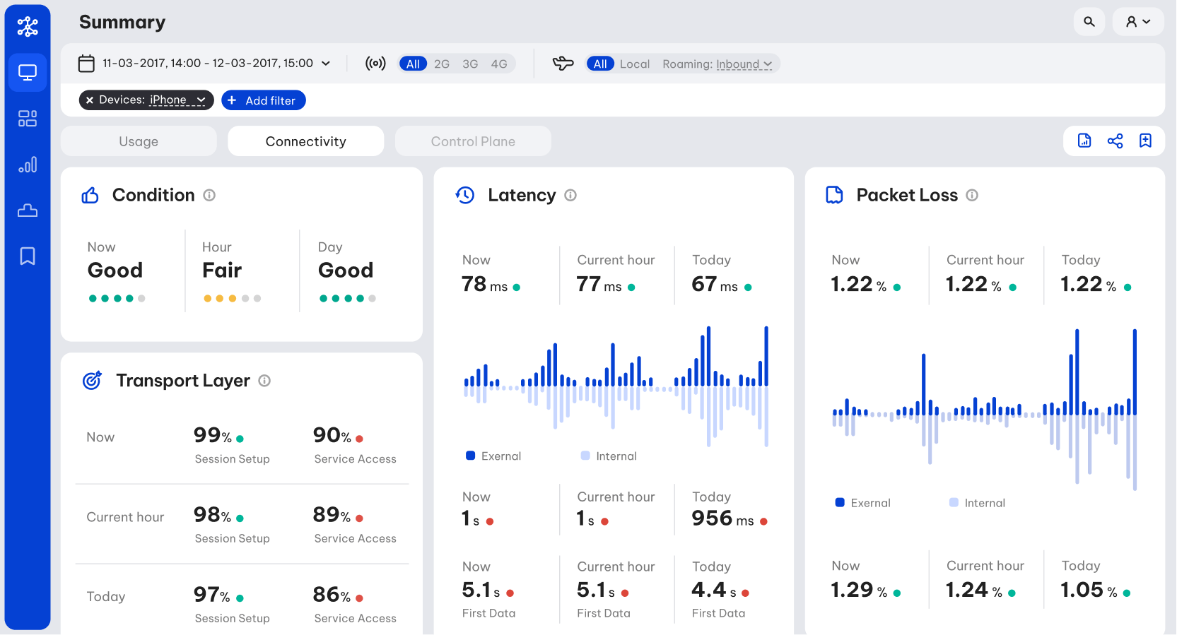
Out of the huge volume of metrics we were able to show, I tried to extract from the stakeholders the most important ones, categorise them into three families (usage, connectivity, control plane) and present them as clearly and concisely as possible. The purpose of this process was to create a dashboard as the landing view of the app, presenting some quick and rough insights on the network.
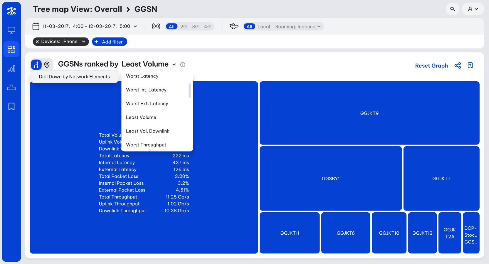
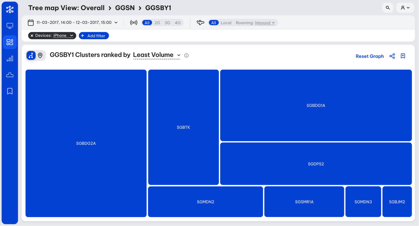
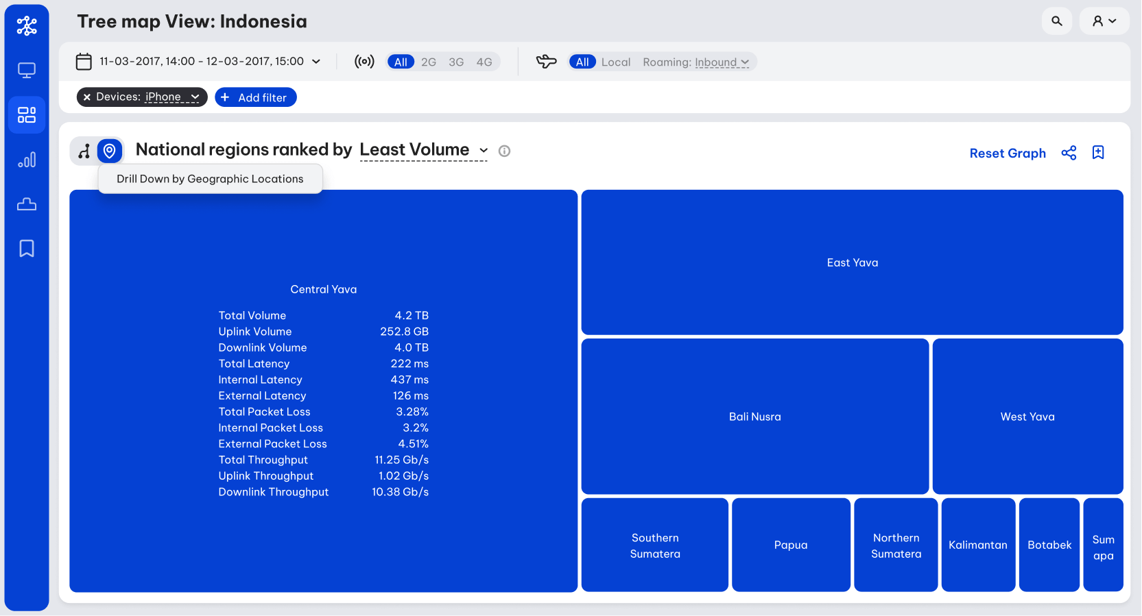
One of the main objectives of the technicians was to spot deficit nodes of the network. I approached this task similarly to code debugging, by isolating big parts of the network, check if they contain a deficiency, and if so, repeat the process by drilling down into that specific part, until the deficit single node. I decided that the best way to visualise that is through a tree map. The node parts classification was done both per node clusters (purely technical), but also per geographic areas.
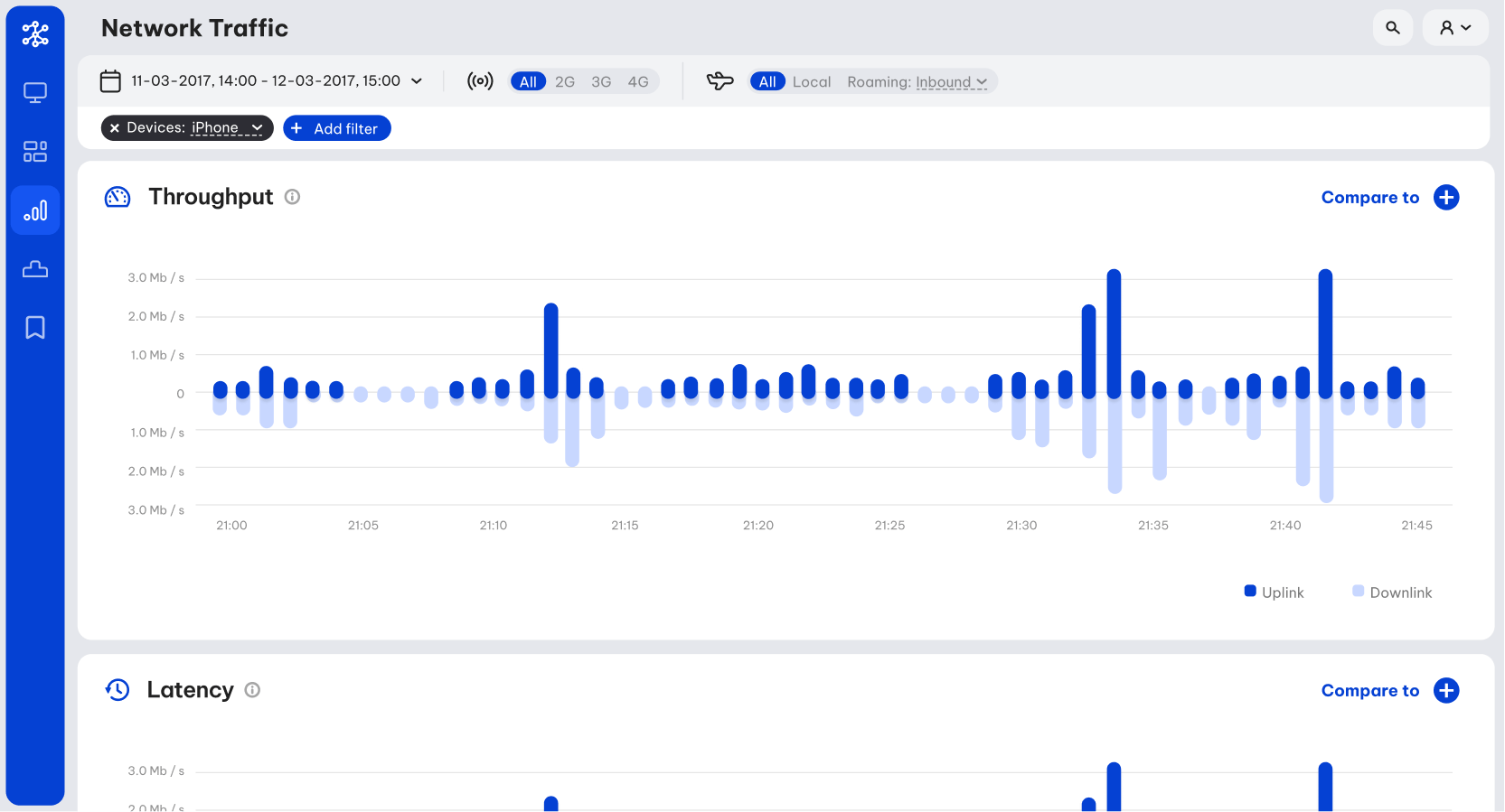
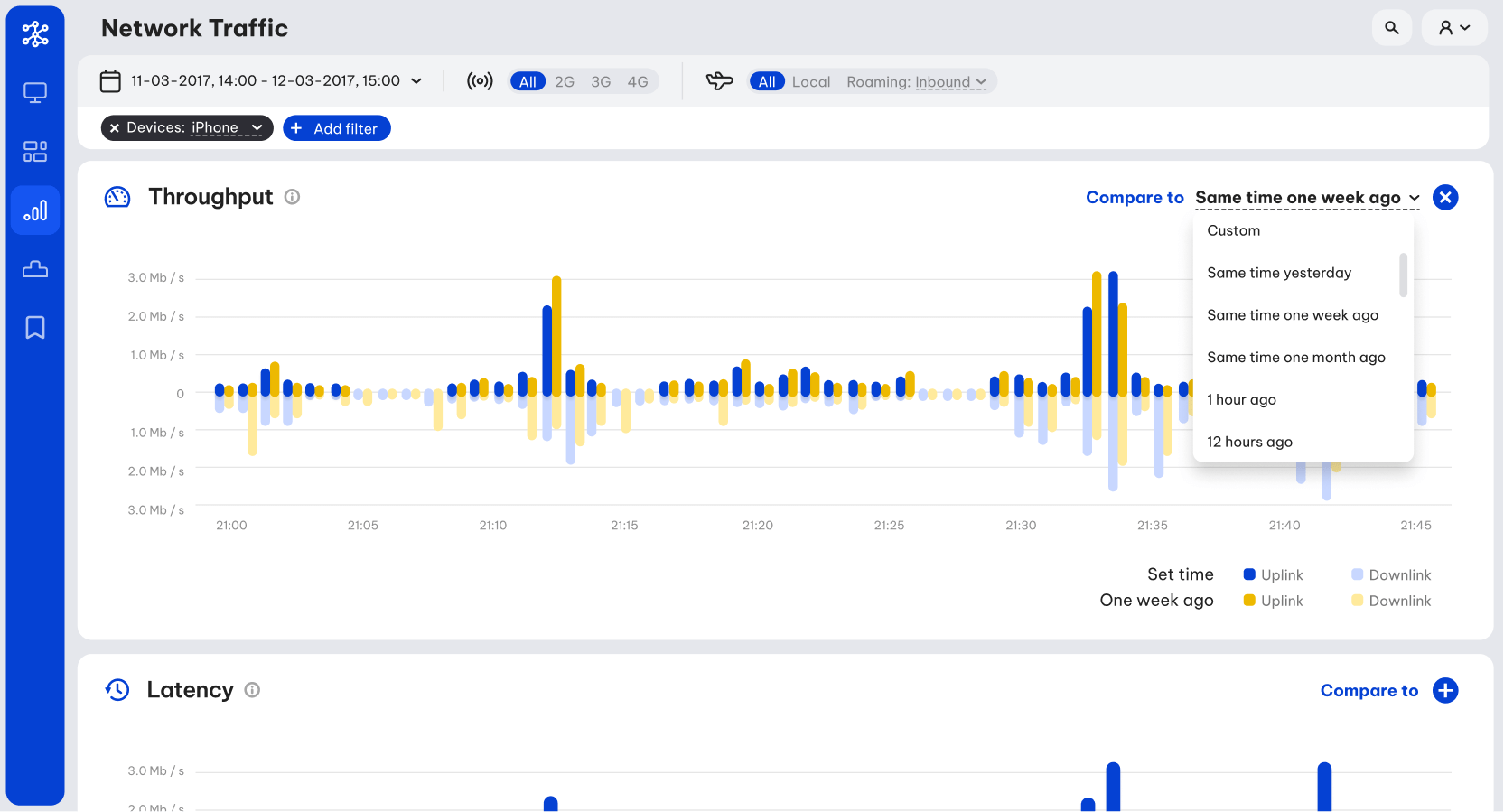
Another important function of the tool was to relate network deficiencies to external events (e.g. fires, earthquakes, accidents). In order to do so, a visual overview over time was needed. So, in this section all the main metrics are presented as time-axis graphs in the selected timeframe. A compare functionality was also designed to help with spotting deviations from regular metric patterns (e.g. compare the current data volume to the respective of the same time one week ago).
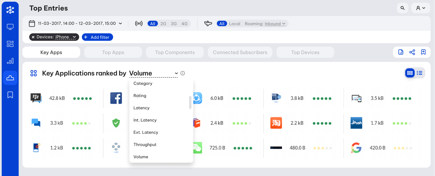
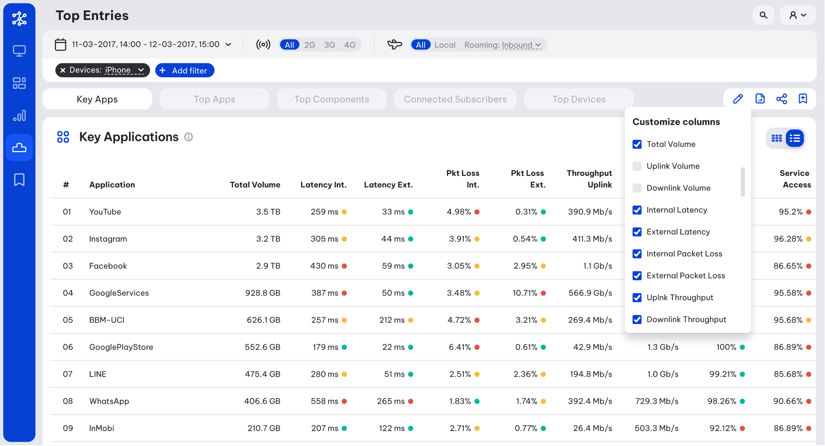
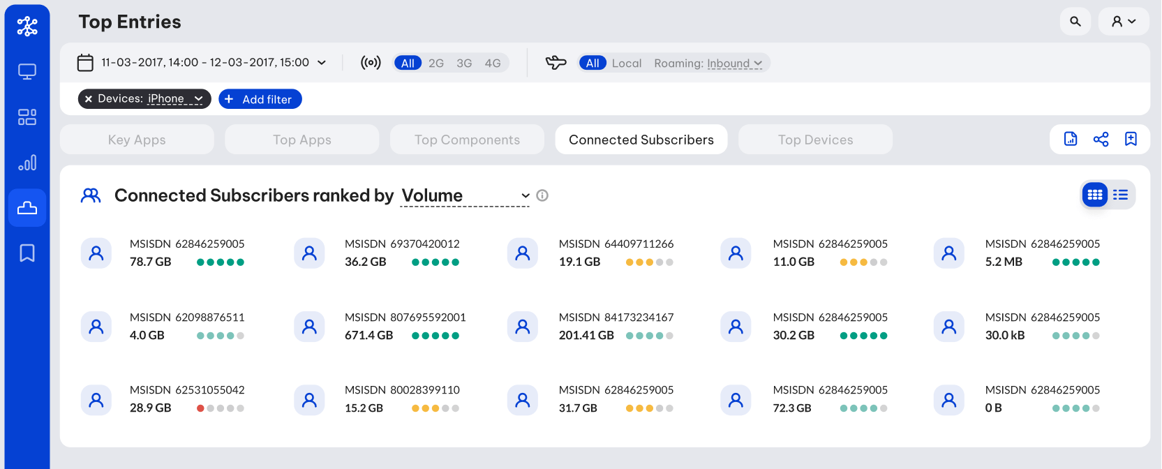
Another approach for spotting anomalies in a data set would be to simply collect the highest and lowest values of an object as per each of it properties. So, the purpose of the next section was to present these highs and lows, organised in five categories.
Finally, since each view is highly customisable with many options for filters combinations and time frames, I suggested that each parameters combination can be "bookmarked" and stored in the last section of the app for quick access. There are also options to extract each dataset into CSV/JSON files and share a customised view.