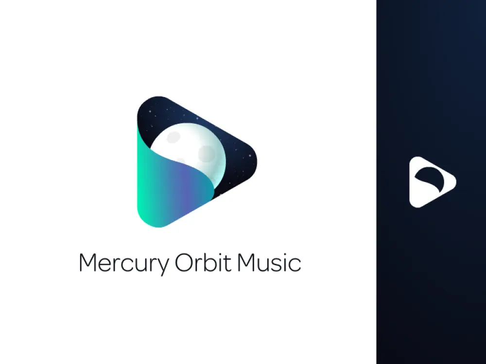
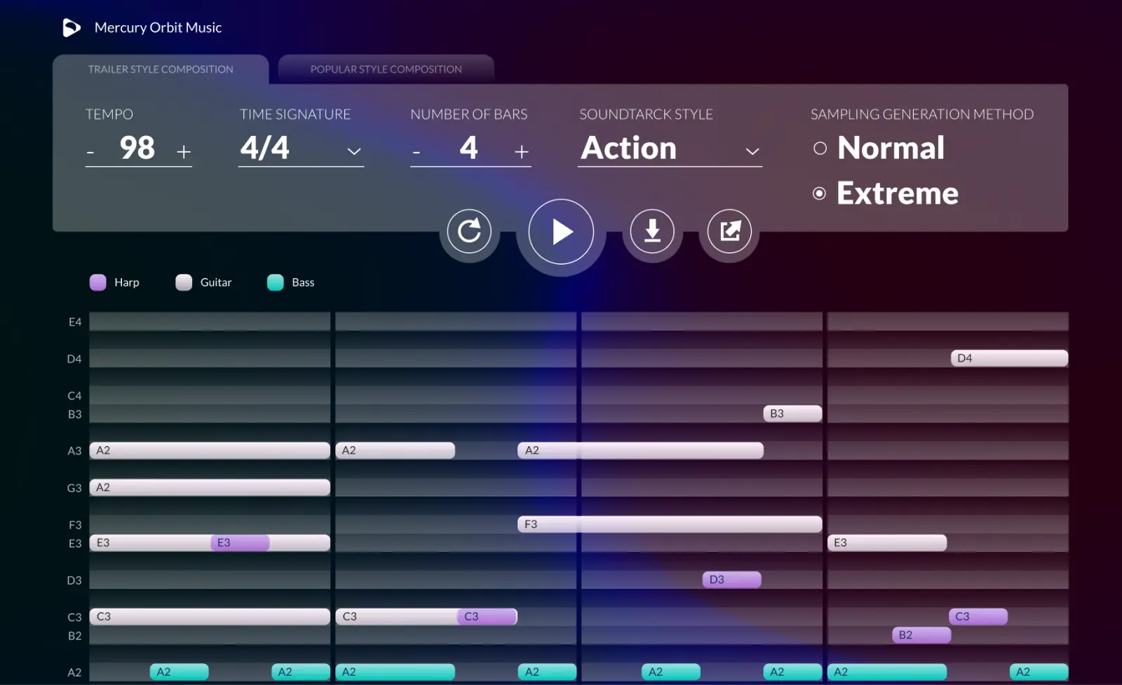
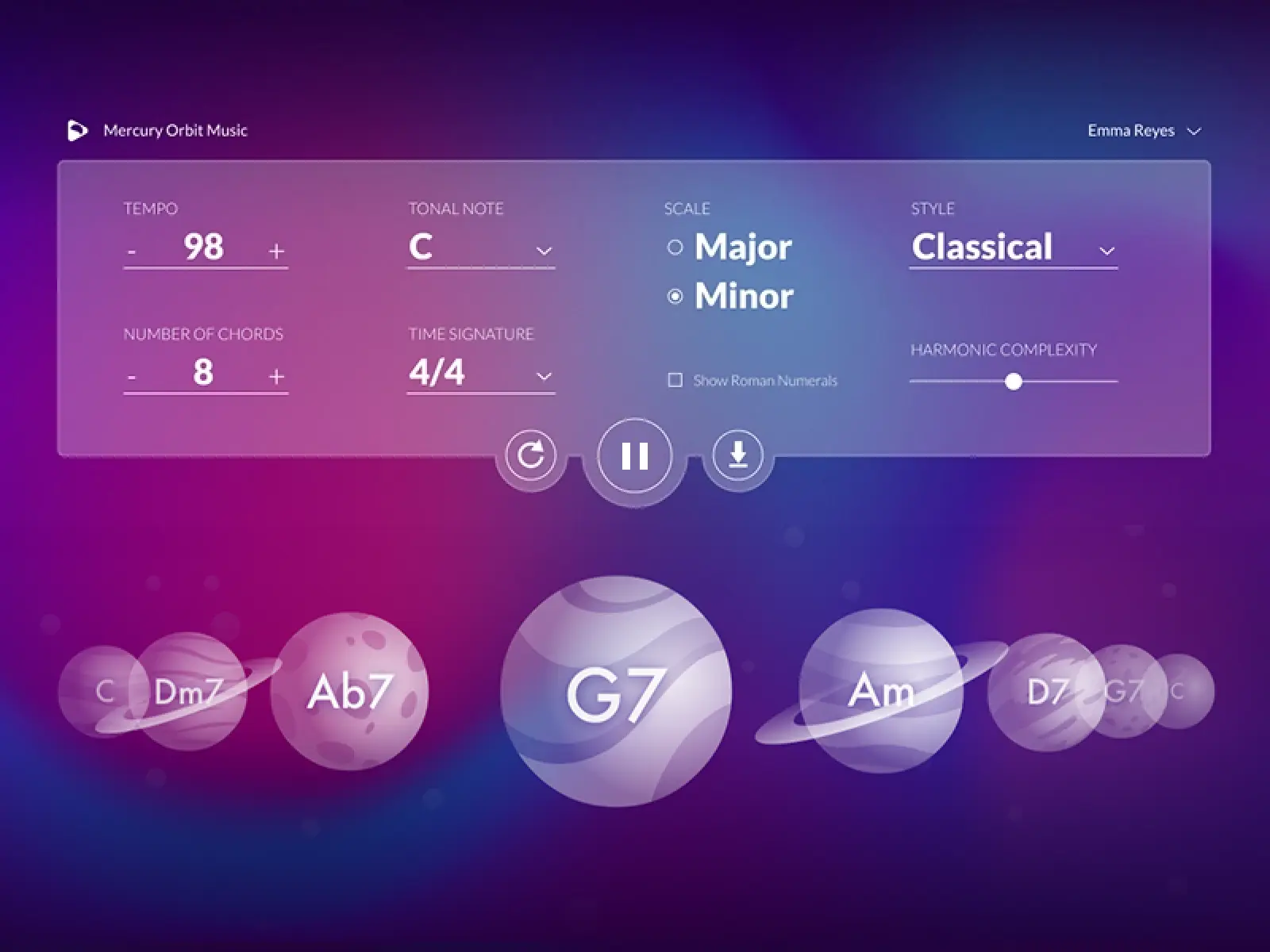
Educational Music apps

Overview

Mercury Orbit Music was a startup with a mission to musically train and educate secondary school students through a series of AI-based applications.

The objectives of the project

My role

In this project I was in charge of all the design aspects. Everything presented here was executed entirely by me.

Logo Design
Branding
Graphic Design
UX Design
UI Design
Web Development

Branding

The character of the project was rather light, as it had both educational and entertaining/gamification aspect. So, I avoided to use too serious and strictly professional colors, like blue, black, brown. I rather chose hues of pink, purple and green, colors that are mostly associated with attributes like creativity and playfulness. I chose to keep the bright green for the logo as this color is often associated with hi-tech innovation (such as coding and matrix-like screens with binary digits). This hi-tech attribute was also desirable as part of the brand, since the apps used sophisticated AI algorithms.

Having in mind the "spacey" name of the company, I decided to associate the branding with this space theme. In the logo design, I incorporated this theme through the planet and starry sky, while also using the characteristic "play button" triangle shape to create the association with music digital tools. I also made sure that the logo works well both in color and monochrome and in all sizes.

Mercury Orbit Music logo Mercury Orbit Music website hero zone

UX Design decisions

In order to make the apps quick and easy to interact with, I tried to keep the amount of controls decided to make them single-screen apps with all the controls exposed and available at once. I exposed all the options both to make them easier to find, but also to provoke the student's interest to experiment with each of them.

The central control of all the apps was the play/pause button, as the ultimate goal of all of them was to eventually play and listen to a final outcome of the user's configurations. so I gave to this button the most prominent position.

To structure the rest of the UI elements, I divided the screen in two horizontal zones. The upper one was the controls area (input) and the lower zone was the display area (output). For consistency and learnability purposes, I used this pattern in all the apps. Since the lower zone was the output area, the one that was active while the musical track was playing, I tried to make it as much interesting and engaging as possible with the use of visualisations.

The Chord Exerciser app
The main view of the Chord Exerciser app
The Rhythm Generator app
The main view of the Rhythm Generator app
The Score Composer app
The main view of the Score Composer app

UI Design decisions

GUI was a very important factor in helping engage the students into the educational activities. So, I tried to make the apps visually attractive by creating rich graphics. Again I utilised the space theme, and represented chords as planets (on the first app). These graphics had also some semantics, as I indicated the minor chords with the ring around the planet. I experimented a lot with gradients and ended up with some interesting concepts. I also used glass inspired elements to create some more eye-catching visual effects. Finally, I used some large typography in the form elements, in order to make those wordings stand out and give a unique character to the configuration panels.

The Chord Exerciser app in play mode
The Chord Exerciser app in action (play mode). The planets roll as the respective chords are being played.
The Chord Exerciser, selectbox expanded
An expanded select box
Modal on the Rhythm Generator app
The "Edit chord progression" modal on the Rhythm Generator app

Links

View more projects