eCourses management

Overview

This project was a radical redesign of the course management section for a platform that provides tools for building and managing online schools. The course manager is one of the most important tools on the admin side (school owner) of the platform, as it is the place where the admin manages all the courses and activities of the school.

The objectives of the feature

My role

This project was a team work. The light tags are the parts that were executed entirely by me, and the dark tags are the parts in which I contributed as part of the team.

UX Research
UX Design
UI Design
Design System Creation

UX Design decisions

All the major UX decisions were based on feedback from the existing users. The communication with the users was indirect through the support department, that provided us with information about common user requests and pain points. We were in continuous communication with them.

The major changes that we did on the main view of the course manager were:

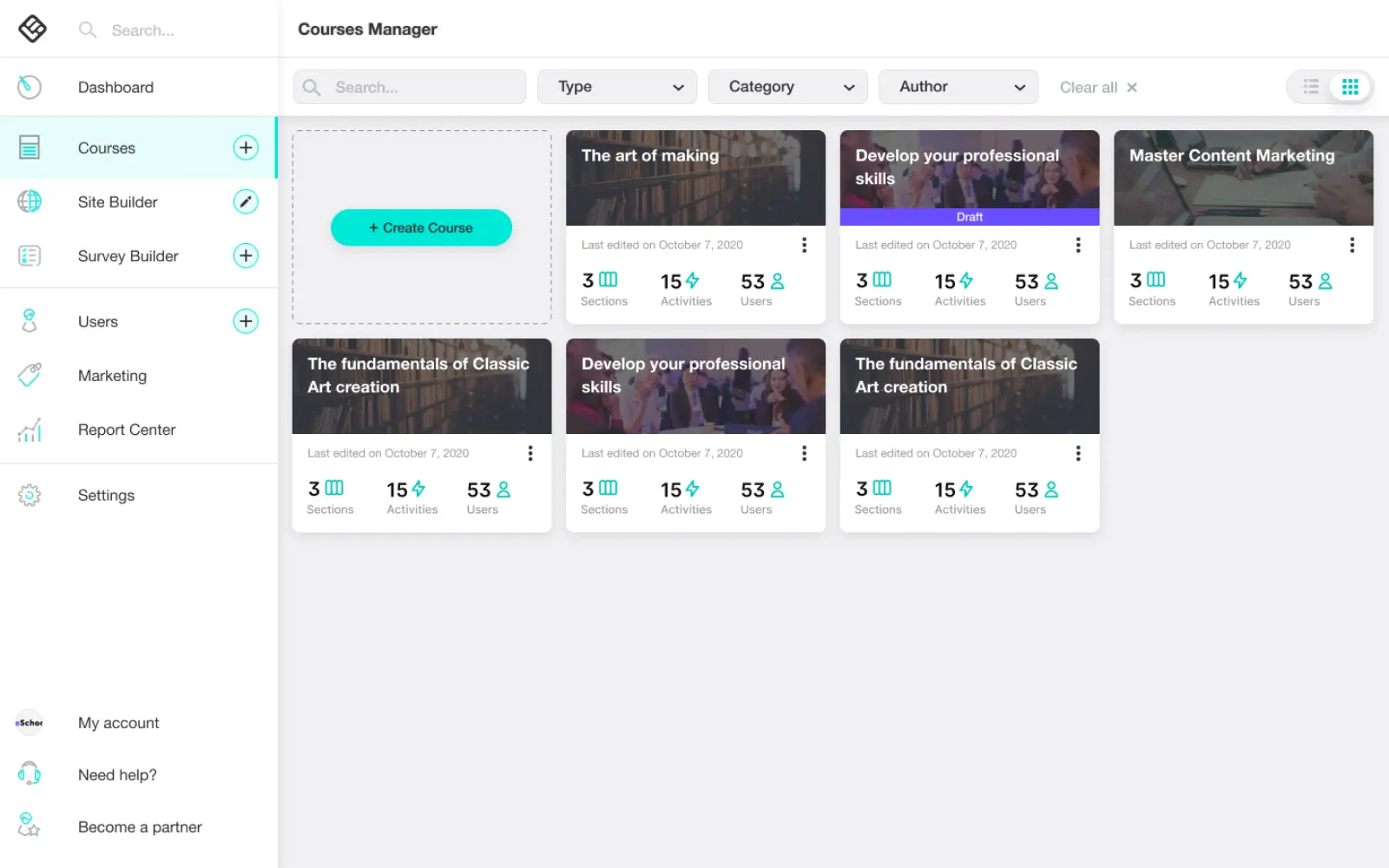
  1. Redesign of the course cards, so that they give a better overview of each course (number of sections, activities and learners).
  2. A more intuitive position of the create new course button in the form of a course card placeholder.
  3. Addition of a list view option of the courses in addition to the existing grid view.
The courses library
The initial main view of the course manager, showing all the existing courses

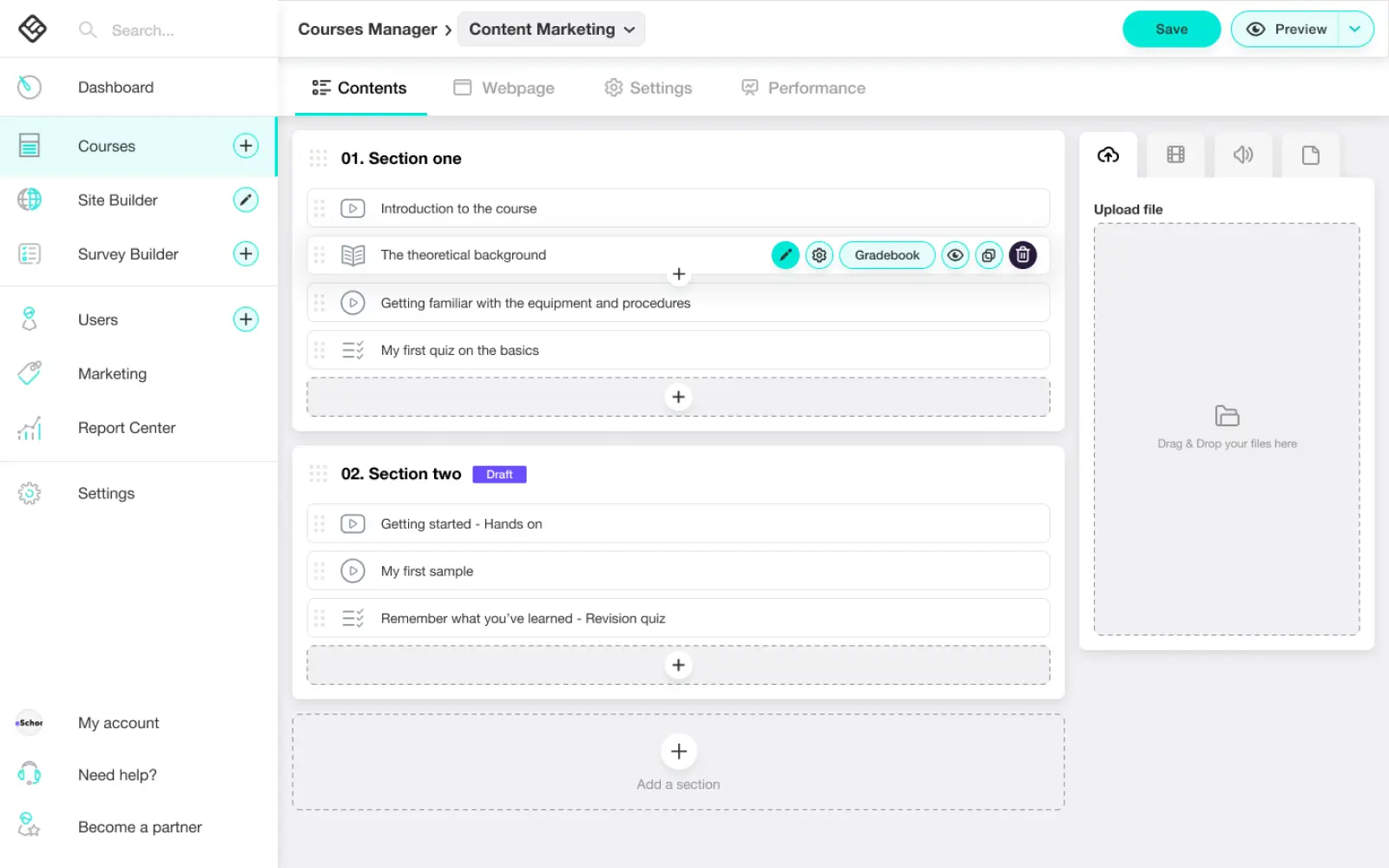
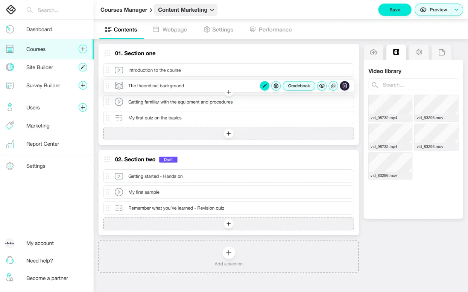
On the "contents" tab we replaced new "+" buttons for adding activities and sections to more intuitive places (exactly where the new item is expected to be added).

We added a media library widget to the right of the course contents, as there was plenty of room for that, providing access ease of local files and quick drag-n-drop functionality. This feature gives the user the flexibility to add media that were already uploaded on other courses, to the current course (which was a desired task and difficult to do so far).

Course contents
The initial view when a specific course is selected, showing the course's contents
Course contents, media library

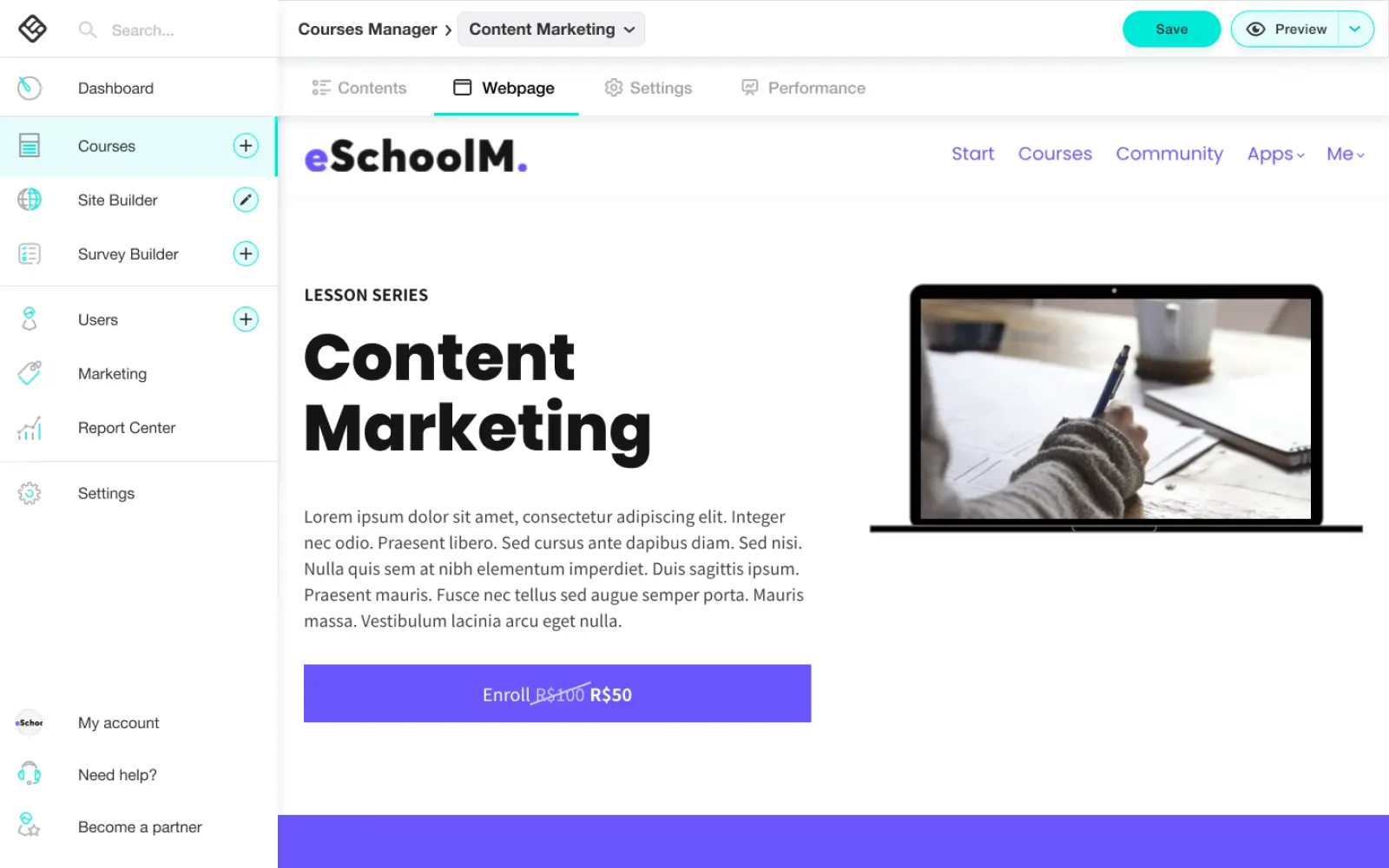
We reordered the tabs, placing the "webpage" second instead of first that used to be its initial position, because it turned out that this tab was not expected as primary and seemed to cause confusion. We also changed the tab names to semantically more accurate ones.

Course webpage editor
The tab that leads to the course's webpage editor

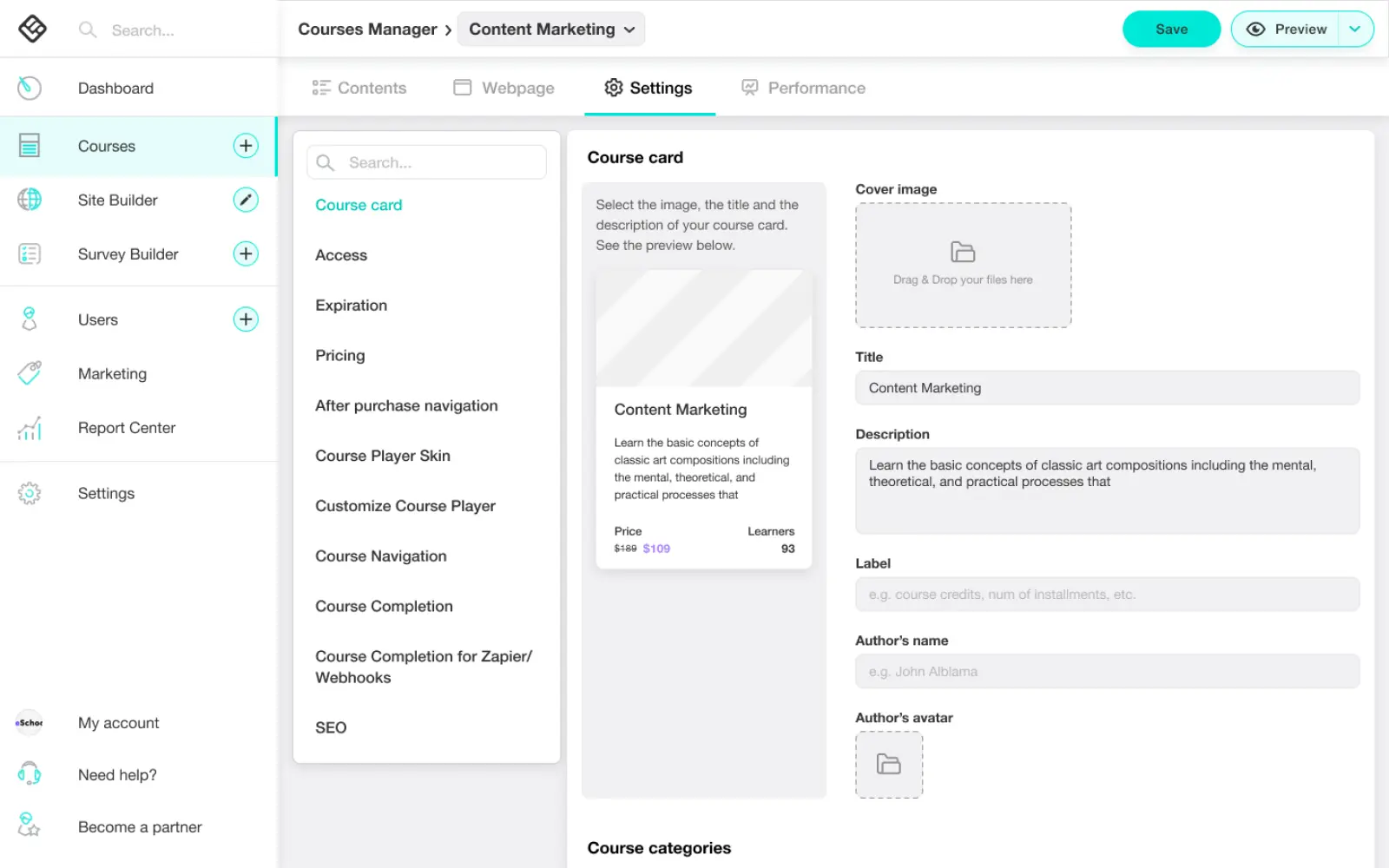
We restructured the Information Architecture. We reduced the number of tabs from 8 to 4, by merging all the configuration options into one Settings tab. After this merge, the volume of the settings became too big, so we grouped and categorised them and added a navigation panel and a search functionality on the left of the setting forms.

Course settings
The unified settings view. Clicking on a settings category on the navigation panel, auto scrolls on that category.

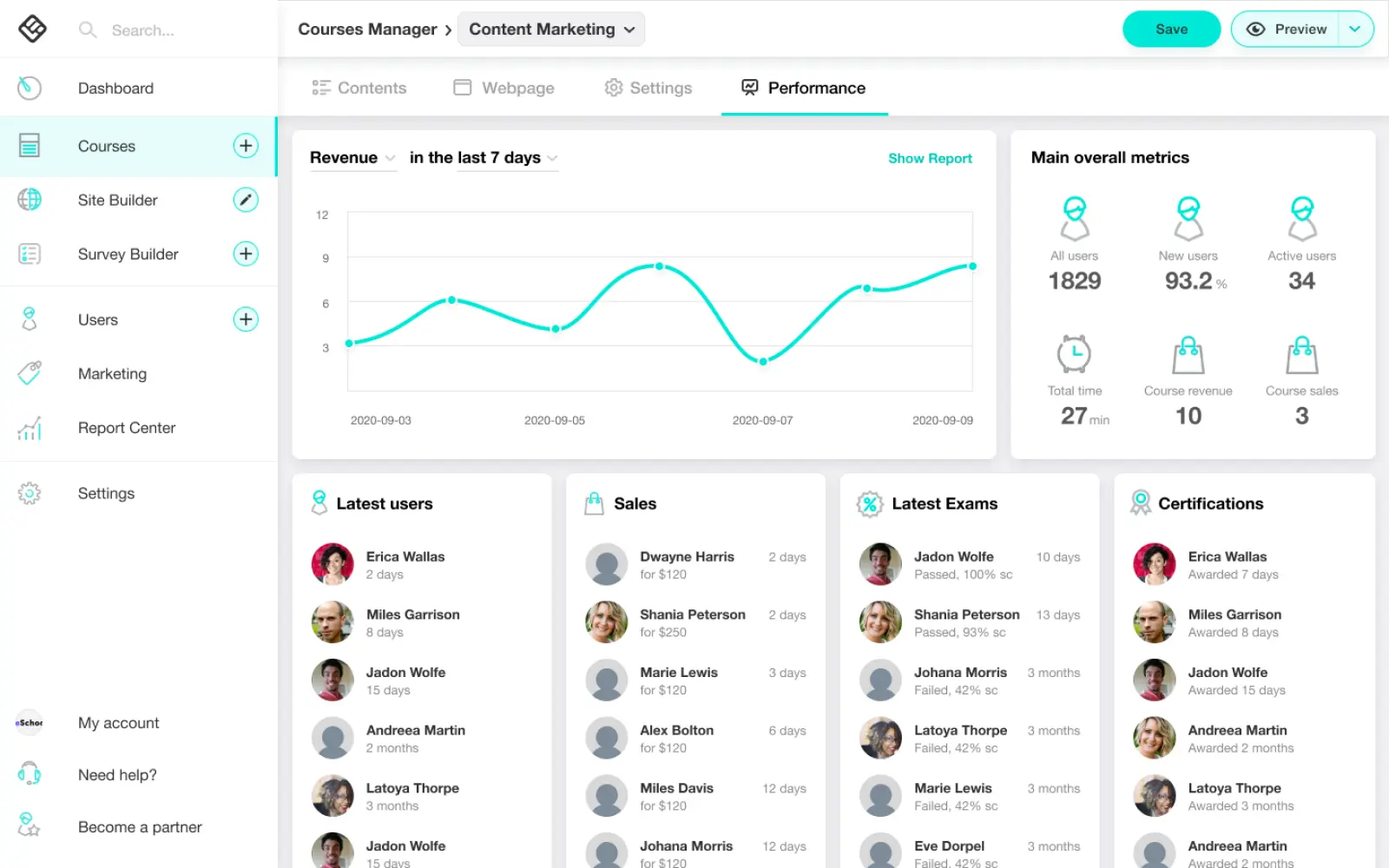
We renamed the dashboard tab to "performance" and placed it last, as it turned to be of totally secondary significance for the users. Keeping the name as "dashboard" would create the impression that it would be the central view.

Course performance dashboard

Design System

There were a lot of limitations in terms of UI, as the brand color, iconography and typography were already established and there were technical difficulties in radically changing the core layout of the platform.

My UI interventions were to unify the GUI, as there were a lot of visual inconsistencies in the UI elements, establish some common UI patterns and give a more modern overall look.

These decisions were integrated into a Design System that I introduced. Here is a sample of some basic components.

Color and typography design system elements
Some basic color and typography elements
Form design system elements
Some basic form elements
Complex component design system elements
Some more advanced, component-level elements

UI Design decisions

The major UI decisions were:

  1. I livened up the brand color by increasing its saturation and slightly the brightness so that it has better contrast with the black text on it.
  2. I introduced a pattern with white panels on grey background to clearly define the elements and imply the unity of stand-alone components (e.g. the media library widget). The subtle shadows were also utilised for the same purpose, in order to increase the contrast between the elements.
  3. I used a lot of "placeholder" style elements (e.g. the create new course and add new section CTAs), as I consider them to be more intuitive (the action trigger is at the exact spot where the actual action will be performed).
  4. Icons addition to the tab titles, which together with the reduction of their quantity, makes them more recognisable and improves the navigation speed.
  5. I redesigned the items grip handles used for drag-n-drop reordering to be aligned with common UI practises and make it more recognisable to the average user. The shadows contribute to the elevation effect while dragging an object.

View more projects