Crypto meme project

Overview

Spam is a rather unconventional Brand & Web Design project with a strong creative aspect. The objective was to build the brand and design the website of a broader cryptocurrency meme project, which included the issuance of a crypto token with some novel deflationary mechanisms and the promotion of its social channels.

My role

In this project I was in charge of all the design aspects. Everything presented here was executed entirely by me.

Logo Design
Branding
Graphic Design
2d Animation
UI/UX Design
Web Development

Branding

The name and character of the project allowed for a lot of creativity and playfulness. With this in mind, I decided to associate the brand with the popular canned cooked pork product. So I chose the brand colors in the spectrum of pink, resembling a meaty color and texture. Pink is also associated with playfulness and emotion, which makes it appropriate for a rather humorous project. Apart from that, I also used the "unsolicited messages sent over the internet" meaning of the term spam, as part of the brand concept.

As for the logo I created a shape that keeps some vague resemblance to currency symbols (the characteristic double transversal lines, e.g. in €, ¥) and also form an abstract S shape, Spam's initial. On the colored version of the logo, I created a fluid meaty texture, while also made sure that it works well both in color and monochrome and in all sizes.
Spam logo light Spam logo dark

UX Design decisions

Meme coins are cryptocurrencies inspired by memes and internet jokes or have some other humorous characteristic. Based on this, all the design decisions were made aiming to engage users through creative and fun concepts and elements. To optimise some of the decisions, such as the way information is conveyed through graphics, I utilised the active community of the project on Telegram by conducting quick polls.

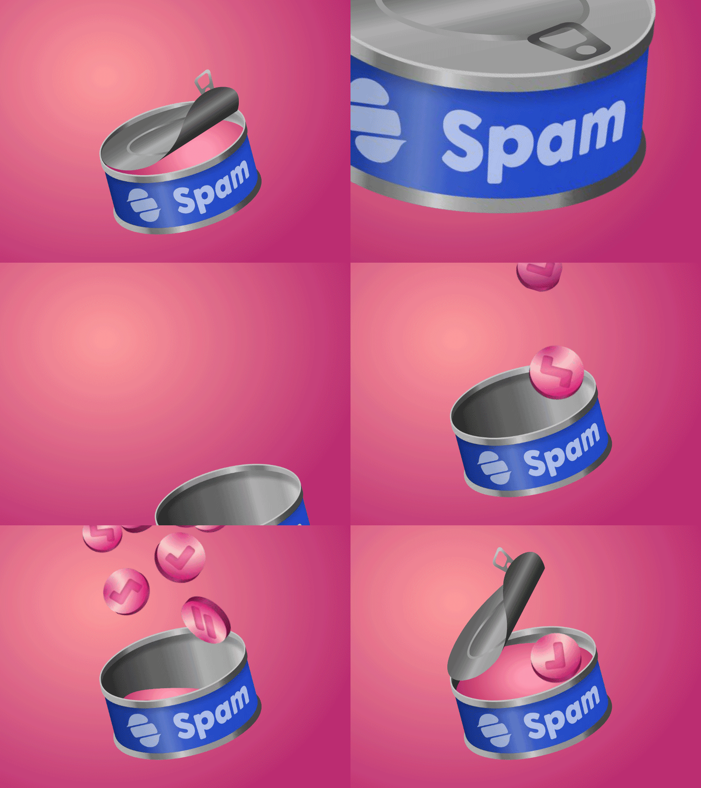
Spam animated clip Meaty artistic composition

UI Design decisions

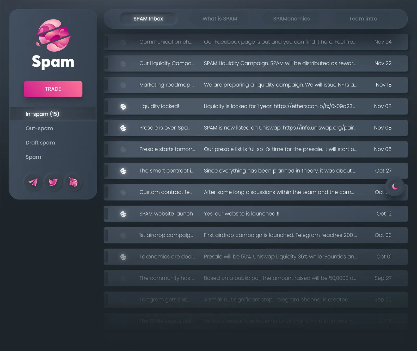
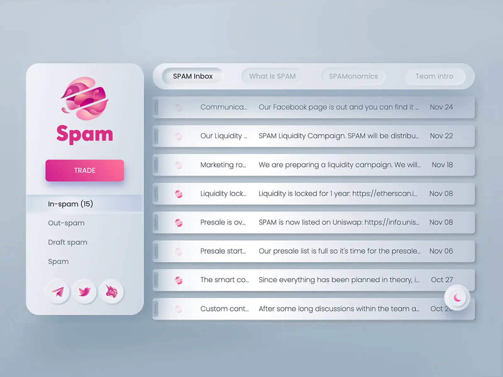
As mentioned above, I used the "unsolicited messages sent over the internet" meaning of the term spam and built the whole website's GUI around this theme. The landing page appears to be a personal email inbox with all the folders being titled spam and similarly. The main tab with the "emails" list serves as the news feed of the project, while the rest of the tabs provide all the project information.

Spam inbox homepage
The website's landing page as a personal email inbox
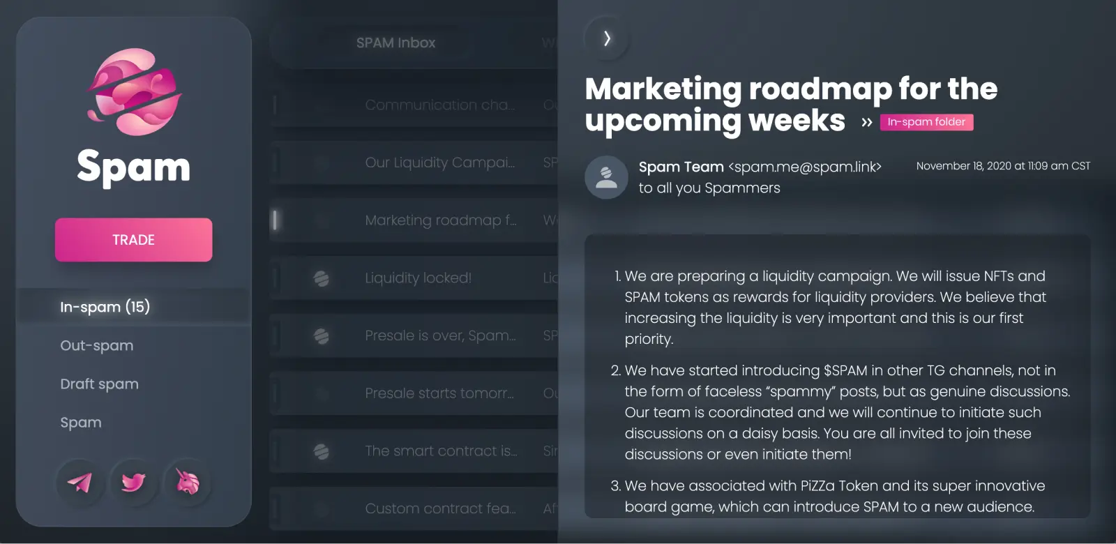
Spam inbox homepage, email open
The expanded version of an "email" comes as a drawer from the righ side

I used a dark default theme as more tech-oriented GUI. The white glows on the active states of various wordings, also aims to the same "tech" feel.

As the website was mostly for presentation and nearly entertainment purposes rather than a strictly task oriented purpose, I gave priority to the aesthetics over maximising the effectiveness/efficiency of the UI. So I used some intense shadows and some neumorphic ideas, which may not help with the visual definition and delimitation of the UI elements, but create an impressive visual effect.

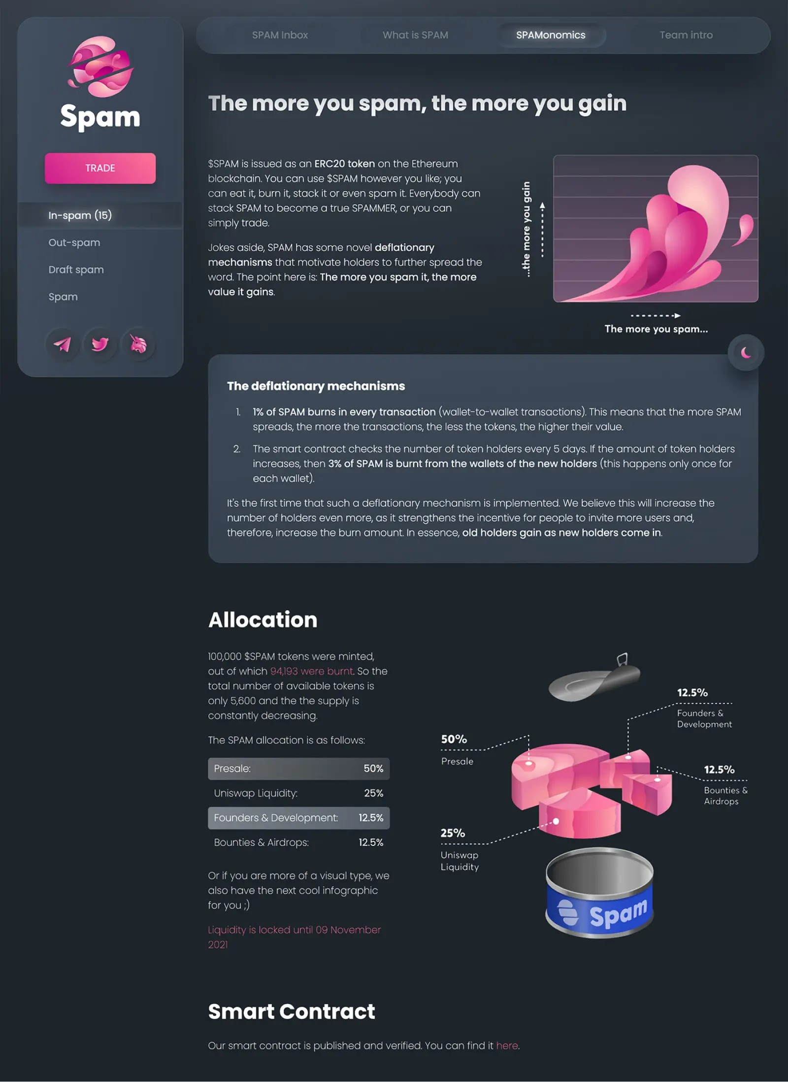
Spamonomics page

I also included a light theme for a richer visual experience.

Spam inbox homepage, light theme
The light theme in the landing page

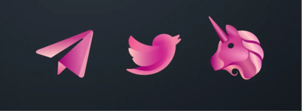
All the graphics and iconography follow the textural and color style of the logo, aiming to an overall visual consistency. I also recreated the telegram, twitter and uniswap icons to match the brand style.

Spam social icons

A few more mockups

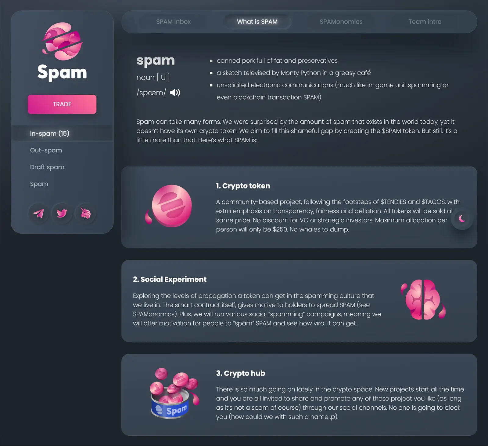
Spam info page
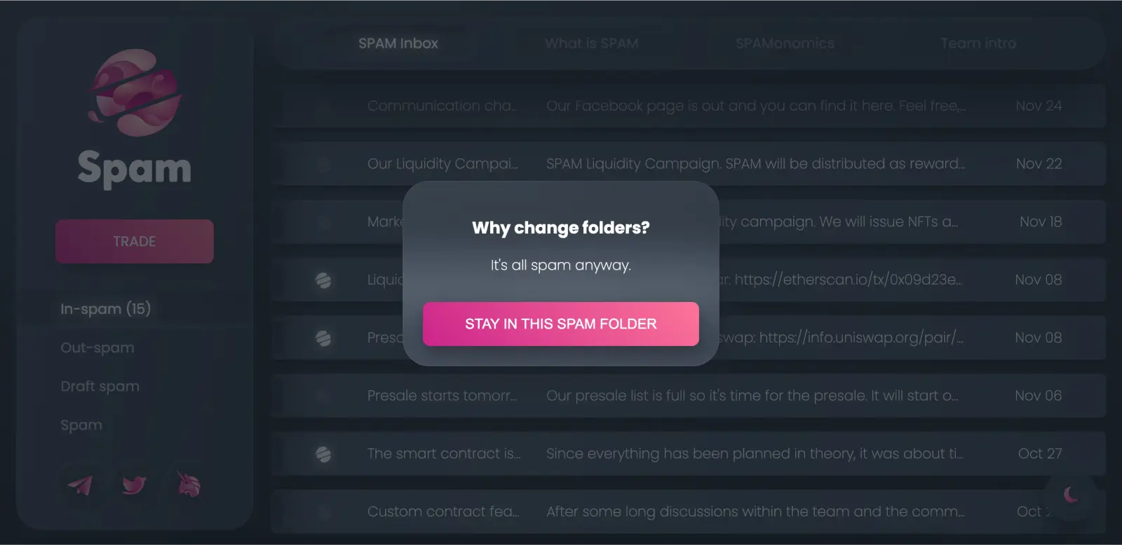
Change inbox folder modal warning
The modal triggered when clicking on any other "email" folder than In-spam

Links

View more projects